APARTMENTS.COM
Does it Feel like Home?
An AI-powered concept for Apartments.com that helps renters compare saved listings by how they'd actually live in them, not just by what they cost.
ROLE
Product Design Intern
TIMELINE
June – August 2025
SKILLS
Product Design
Prototyping

BACKGROUND
Apts.com is the largest rental marketplace in the country
Apartments.com is the largest rental listing marketplace in the U.S., owned by CoStar Group, with 40M+ renters visiting the network every month. Its scale is also the challenge: renters searching across that much inventory lean hard on the platform's filters: price, amenities, commute, etc. just to get the results down to a manageable size.
THE PROBLEM
"Favoriting" ≠ making a decision
While filtering helped, what came after didn't. Once renters saved listings to Favorites, the tool stopped there. It let people "save for later," with no way to compare or prioritize what they'd found. Renters described it plainly: a parking lot for listings.
MY ROLE
There was no brief, so I wrote one
The ask was simple: Apartments.com had no way to compare listings after saving, a gap most e-commerce experiences today had already solved, with AI floated early on as a possible direction. Beyond that, there was no brief. I scoped the problem, decided how to run the research, and designed the solution solo, taking the concept through several rounds of iteration and stakeholder feedback.
RESEARCH
Side-by-side comparisons are familiar
Starting with a chart wasn't a guess: Zillow and RentCafe, Apartments.com's competitors, both structure comparison around one with clear CTAs to push renters to turn favorite listings into tours and applications. So I ran a competitive audit against both, then surveyed recent apartment-searchers to see if the same structure would hold for Apartments.com.

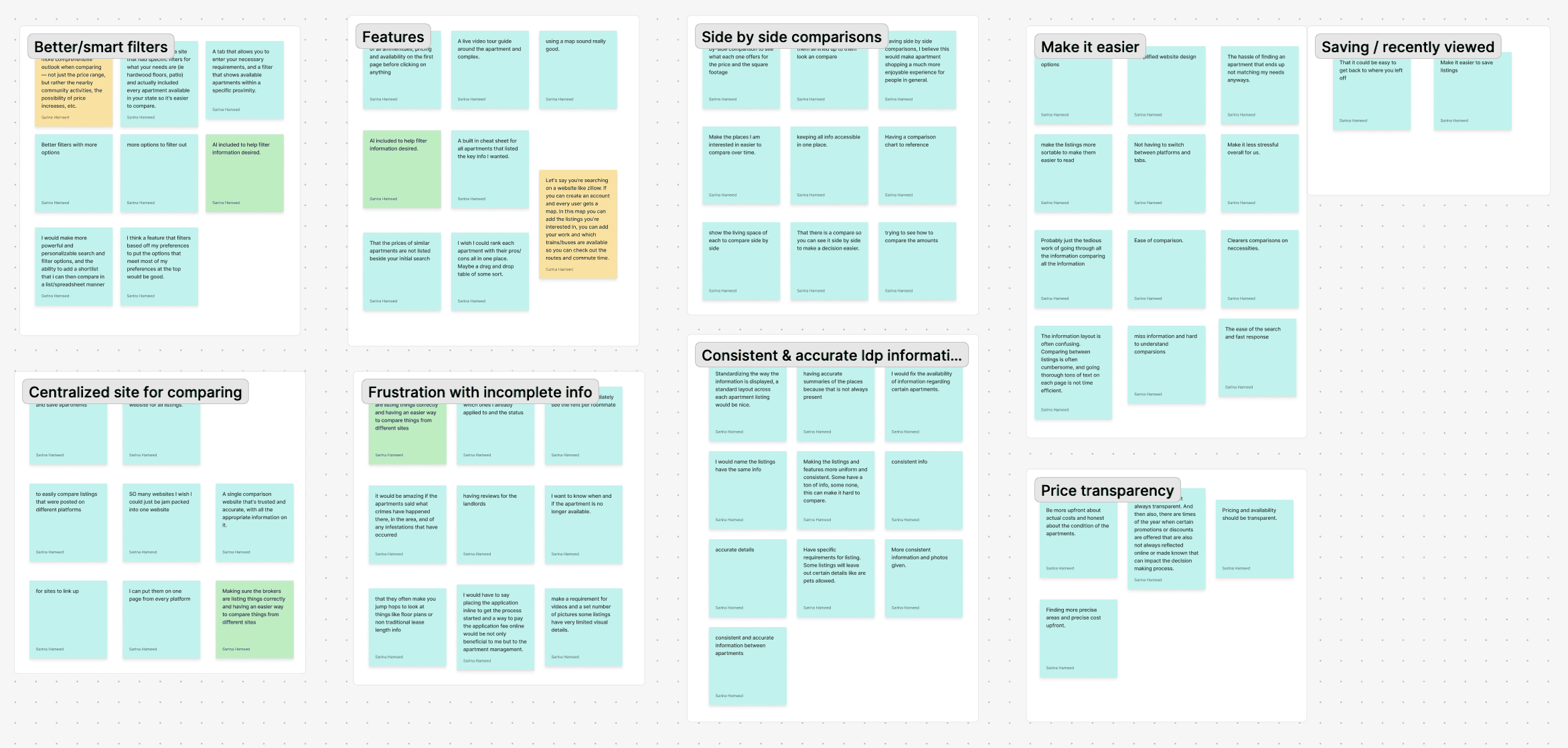
100% of renters agreed on price. Nothing else.
After surveying 55+ recent apartment hunters, 74% wanted a side-by-side comparison, which affirmed the chart. But priorities splintered everywhere past price, e.g. location (69–81%), commute and safety (50–60%): no two renters weighing the same things.
SO WHAT DOES THIS MEAN?
A chart was right but not the whole answer
Renters didn't want the chart replaced, they wanted it to know them. A single side-by-side view could show the same facts to everyone, but it couldn't show what actually mattered to each renter, and neither Zillow nor Redfin had gone any further than that baseline chart. That showed me a real business opportunity to differentiate Apartments.com from the rest of the category.
THUS, I ASKED
How might we move beyond side-by-side comparisons using AI to help renters confidently compare apartments?
CONTEXT
Wait, isn't more filtering the answer?
Apartments.com already filters hard on logistics: price, amenities, commute. When I brought an early chart concept with an AI rating based on practical filters to my manager, his read was direct: "we already filter by all those specifics." If AI was going to add anything, it needed to go where the platform didn't — though at that point, I wasn't sure exactly what that meant.
EARLY ITERATIONS
Three tabs were too dense
The first structure split results into List, AI, and Map tabs. The map mirrored what renters had already seen on the search results page — same pins, same view, with nothing new to justify the extra tab. It added density on first glance without adding a reason to stay, so I dropped it.

A chatbot isn't always the AI solution
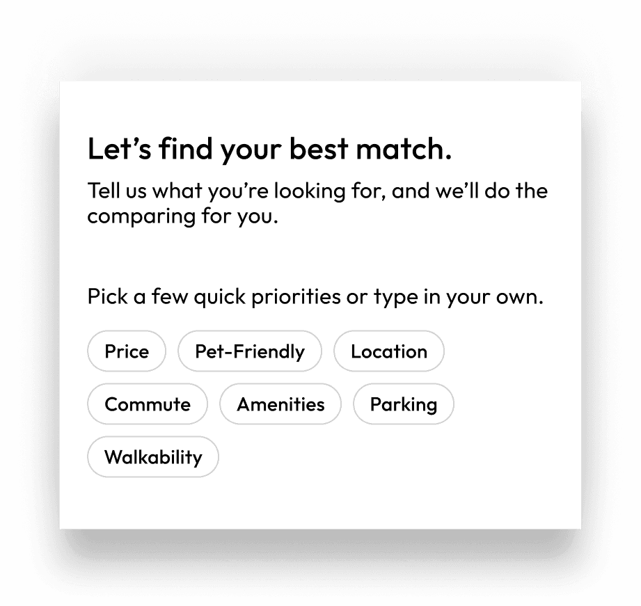
My first AI concept was a typical chat interface that asked users what they were looking for. My manager's feedback was direct: "AI should know already and tell me." That pushed me to actually let AI "do the work" instead of just holding a conversation — which meant turning data Apartments.com already had into filters built around emotion, not just logistics. That's where the emotional lens came from.
WHICH LEFT ME (RE)ASKING
How might we move beyond side-by-side comparisons using AI to help renters confidently compare apartments through both practical and emotional lenses?
DESIGN DECISIONS
Build upon Favorites
Renters arrive at Favorites having already filtered hard on the search page. Adding another round of filters would repeat effort, not reduce it. Decision fatigue was survey respondents' top complaint, so the fix had to sit on top of what they'd already saved, not ask them to start over.
The data existed, but wasn't renter-facing
Renters said the tools available only showed facts, e.g., price, square footage, when what they actually wanted to know was how a place would feel: quiet, walkable, cozy. Apartments.com already collected the answer with tools like SoundScore and Walkscore, which the business invested in with licenses, but hadn't effectively surfaced. I used it to power filters people actually think in, like "Quiet" or "Suburban."
Rank the listings
Competitors like Zillow solved the side-by-side layout, but still left the comparison math to the renter, and missing listing data made even that unreliable. Instead of another chart, the tool ranks listings and surfaces a clear #1, with a "see full ranking" option that shows the reasoning behind it, closer to a decision than a longer list to scroll.
THE SOLUTION
Final prototype
This project had a blue-sky scope more than a business case. Based on multiple rounds of iteration and feedback, the final concept spans over 20 hi-fi screens with meaningful micro-interactions, built inside Apartments.com's Mortar design system. Here's the walkthrough:
NEXT STEPS
Four places I'd take this next
Feedback from PMs, content design, and product design pointed to:
Making personalization visible
Improving feature discoverability within Favorites
Adding clear tour/contact CTAs
Sharing anonymized insight back to property managers.
REFLECTION
What did I learn?
Framing AI output around emotion and not just the facts made it feel trustworthy rather than clinical. Designing for decision confidence meant knowing when to show less: a #1 pick, not a bigger chart. Working across that many interaction-heavy screens inside an elaborate design system also built real confidence in my Figma skills as I prototyped at a level I hadn't prior to this role.
And most of all, as my first professional internship, learning to take initiative and advocate for my design decisions was key.
Up next…

JPMorganChase
UX Design Intern
JPMC
Research
UX Design
Prototyping
AI